Regression with Complex Numbers in Python
This is a small aside that didn’t quite fit into my article about linear regression. Suppose that we want to do regression with complex numbers. When doing regression with real numbers, we looked at squared residuals, but the complex numbers have a distance metric that is slightly different. How can we accomplish this? Let’s first take a look at visualizing complex-valued functions in Python.
Complex Functions in Python
For simplicity, I will be restricting myself to functions of one complex variable so that we have clear visualizations. This construction is fairly straightforward, so I’ll just give the code and then a brief review of what is happening.
import cmath
import numpy as np
import pandas as pd
%matplotlib inline
import matplotlib.pylab as plt
from numpy.random import multivariate_normal

class complex_function:
    def __init__(self, grid_min, grid_max, grid_step, function):
        real_grid = np.arange(grid_min, grid_max, grid_step)
        complex_grid = np.arange(grid_min, grid_max, grid_step)
        xx, yy = np.meshgrid(real_grid, complex_grid, sparse=True)

        self.input_grid = np.vectorize(complex)(xx, yy).ravel()
        self.output = function(self.input_grid).ravel()
        self.function = function

    def plot(self):
        plt.figure(figsize=(20,20))

        for point in range(len(self.input_grid)):
            plt.plot( [self.input_grid.real[point], self.output.real[point]],
                      [self.input_grid.imag[point], self.output.imag[point]],
                      color = 'blue',
                      linewidth=.2,)


        plt.scatter(self.input_grid.real,
                    self.input_grid.imag,
                    color = 'blue',
                    label = 'Input Grid')

        plt.scatter(self.output.real,
                    self.output.imag,
                    color = 'red',
                    label = 'Output Grid')

        plt.legend(prop={'size': 20})


    def generate_sample(self, var_scale, plot = False):
        #this is a complex normal distribution for noise

        real_noise, imag_noise = zip(*multivariate_normal(mean = (0, 0),
                                                          cov = var_scale*np.identity(2),
                                                          size = len(self.input_grid)))

        complex_noise = np.vectorize(complex)(np.array(real_noise),
                                              np.array(imag_noise))

        with_noise = self.output + complex_noise

        if plot:

            self.plot()
            plt.scatter(with_noise.real,
                        with_noise.imag,
                        color = 'green',
                        label = 'Generated Sample')

            plt.legend(prop={'size': 20})

        return with_noise
This class can both visualize a complex function of one variable and generate a sample from that given function. The class is initialized by passing a grid min, max, and step size to determine a grid of input values along with a function to be applied. In the plot method, we simply plot the input and output grids, drawing a line for each evaluation of the function.
The initialization also stores the input grid as well as the result of applying the function. As an example, suppose that I have the function \(z = (1+i)w + (-1+2i)\). I can define this function:
def f(w):
    return complex(1,1)*w+complex(-1,2)
I will create an instance of my class:
test = complex_function(grid_min = -2,
                        grid_max =  2,
                        grid_step= .1,
                        function =  f)
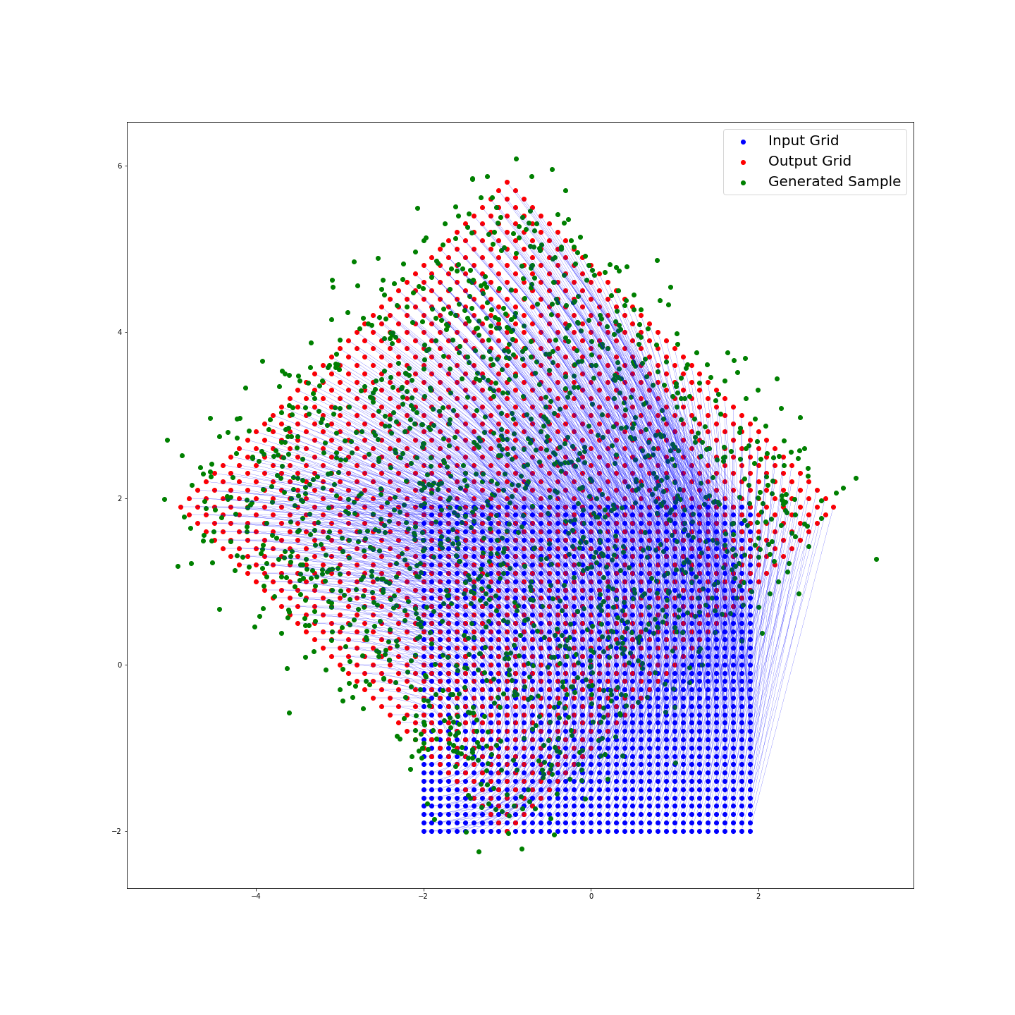
Now if I call the method test.plot() I will have the following graph:

Finally in the generate_sample method, we add a normally distributed amount of noise to each evaluation of the function. We can specify
var_scale, a constant that is multiplied by our covariance matrix to determine the
spread of our added noise. I have chosen to make this covariance matrix diagonal, representing that the noise added in the real and complex directions is independent.
Calling this method with test.generate_sample(var_scale= .1, plot = True) gives:

Implementing Linear Regression
Now that we have a bit of a handle on things, how do we perform our regression? Suppose that we have input \(w_j\) and output \(z_j\). I will define our loss using the complex modulus, giving the following:
\[ \underset{\beta_0, \beta_1}{\operatorname{arg\,min}} \sum_{j=1}^n ||z_j - \left(\beta_0 + \beta_1 w_j\right)||^2 = \underset{\beta_0, \beta_1}{\operatorname{arg\,min}} \sum_{j=1}^n \left(\overline z_j - \left(\overline{\beta_0} + \overline{\beta_1} \overline w_j\right)\right) \left(z_j - \left(\beta_0 + \beta_1 w_j\right)\right). \]
Here I have used the identity that \(||z||^2 = z \overline z\) for any complex number. We can see that when we take the derivative and solve, the only difference will be the inclusion of the conjugate transpose in place of just the transpose. So we have the solution:
\[ \hat\beta = \left(X^*X\right)^{-1}X^* z. \]
where \(X\) is our matrix of observations \(w_j\) and \(X^* = \overline{X}^T\) is the “conjugate transpose”. (Note that there is nothing particuliar about this solution being for one independent variable).
In Python, I can implement this as another class object which is initialized with two arrays of observations, with \(W\) as our independent variable and \(Z\) as the response variable:
class complex_linear_regression:
    def fit(self, W, Z):
        W = W.ravel()
        Z = Z.ravel()

        X = self.design(W)
        X_star = X.conj().T
        Z = Z.reshape(-1, 1)

        self.beta = np.matmul(np.matmul(np.linalg.inv(np.matmul(X_star, X)), X_star), Z)

    def predict(self, W, plot = False):
        W = W.ravel()
        X = self.design(W)
        pred = np.matmul(self.beta.T, X.T).ravel()

        return pred

    def residual(self, W, Z, plot = False):
        pred = self.predict(W)

        if plot:
            plt.figure(figsize=(20,20))
            plt.scatter(pred.real, pred.imag, color = 'black', label='Predictions')
            plt.scatter(Z.real, Z.imag, color = 'green', label = 'Actual Values')
            plt.legend(prop={'size': 20})

        polar = np.vectorize(cmath.polar)(Z - pred)
        polar = polar[0]
        return np.sum(polar)/len(W)

    def design(self, W):
        W = W.ravel()
        return np.c_[np.ones(len(W)), W.reshape(-1, 1)]
As an example, I will use the same function I used above:
Z = test.generate_sample(var_scale = .1, plot = False)
W = test.input_grid
I first define and fit the regression to my data:
reg = complex_linear_regression()
reg.fit(W, Z)
At this point I am able to view the regressions’s coefficients reg.beta:
array([[-0.99465742+2.0105358j ],
       [ 0.99627609+1.00742867j]])
As I only added a very small amount of noise, we can see that the predicted coefficients are very close to the actual distribution.
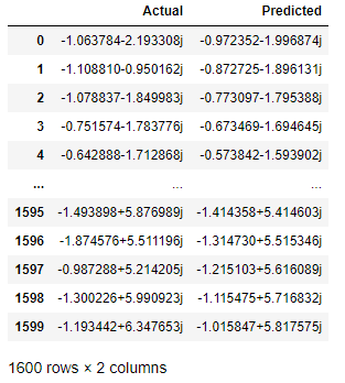
I can use the predict method to see what values my regression will predict and compare the predicted and actual values for our target variable:
predictions = reg.predict(W, plot = False)
values = {'Actual':Z, 'Predicted':predictions}
residual = pd.DataFrame(values)
Here is the data frame (as appears in Jupyter):

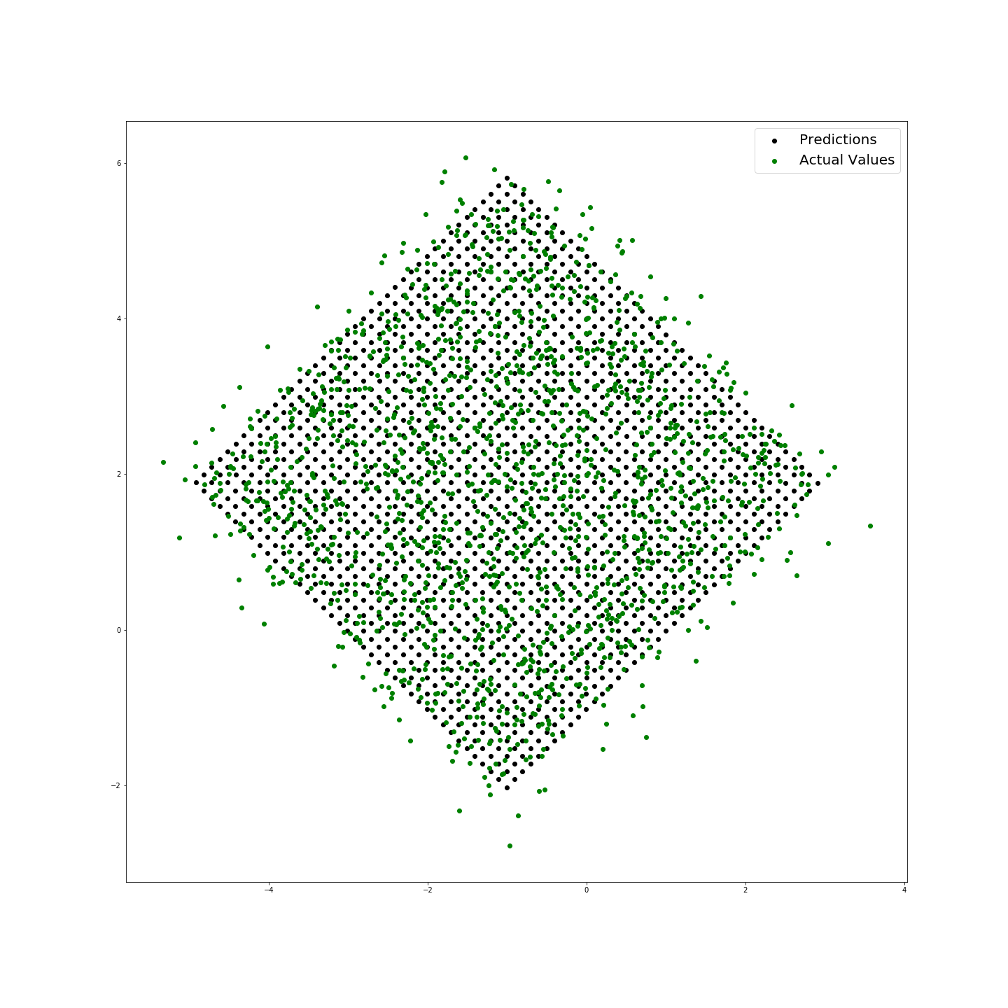
I have also included a method to visualize these residuals and return the mean loss (the difference in modulus between predicted and actual values):
reg.residual(W, Z, plot = True)
The above shows that the prediction has a mean modulus loss of 0.40703018315821154 and provides the following plot:

Code used in this article can be found here.